Brooks Brothers Plumbing
Logo design
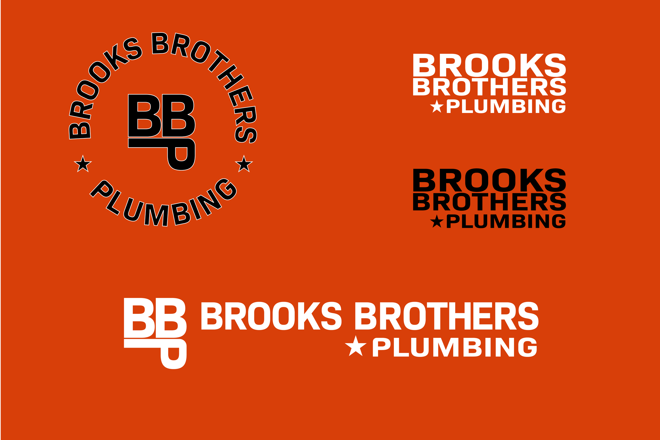
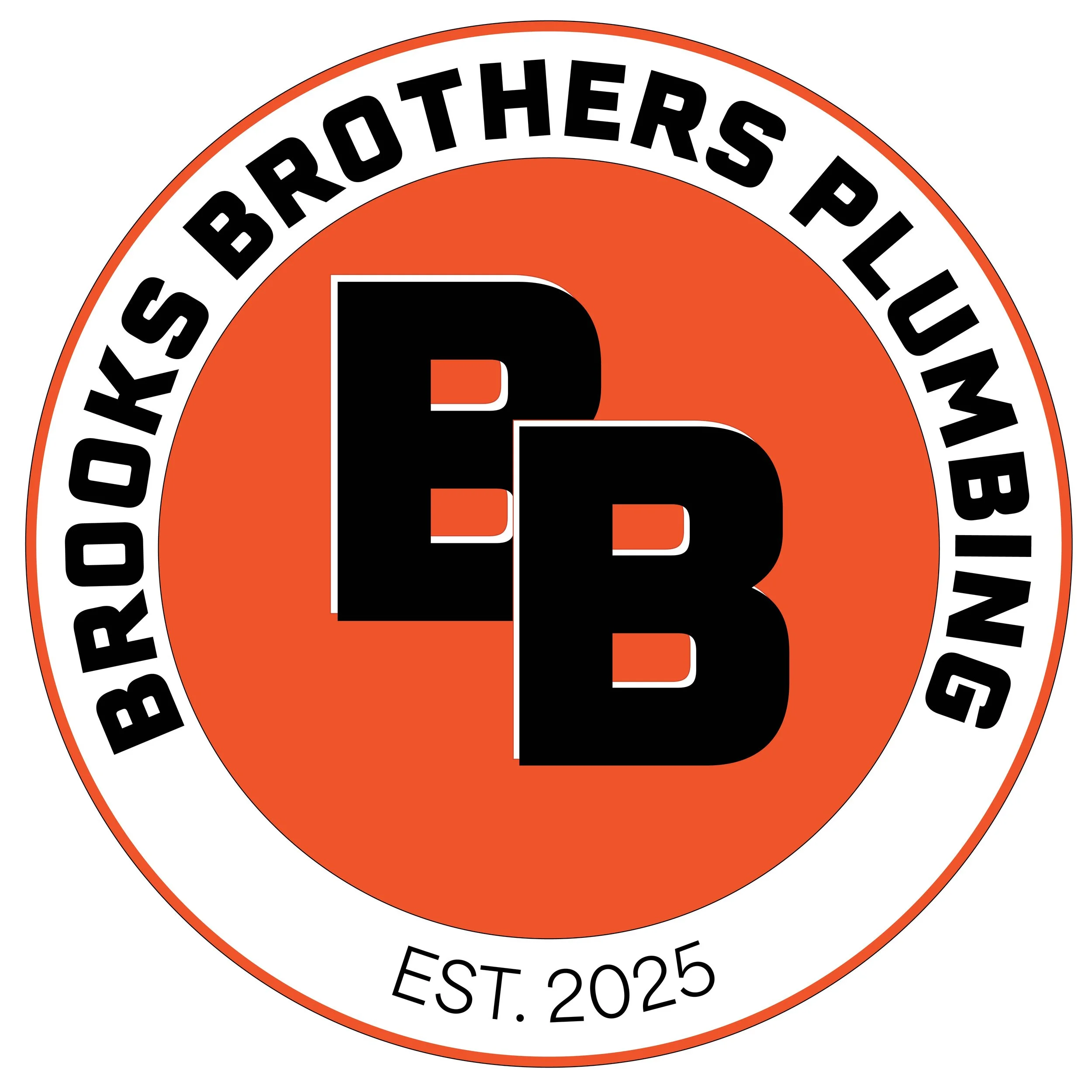
When I was approached about designing a logo for a plumber going out on his own, I was thrilled by the opportunity. After an in-depth interview with the owner, Matt, we decided on something bold, recognizable, and timeless. Matt really wanted to incorporate a colour palette which included green or orange, or a combination; so a design that could work in both black and white, and in colour, was imperative.
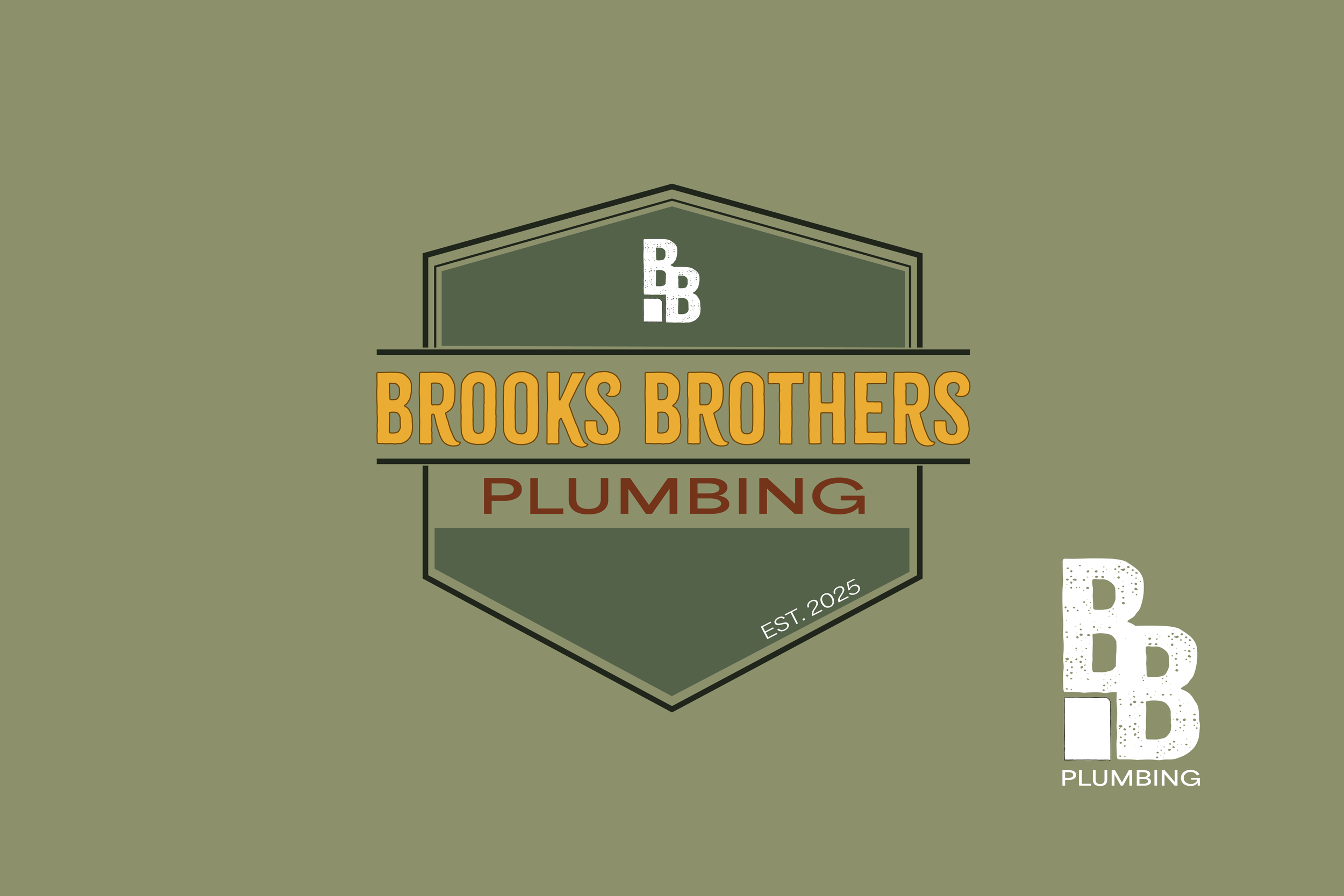
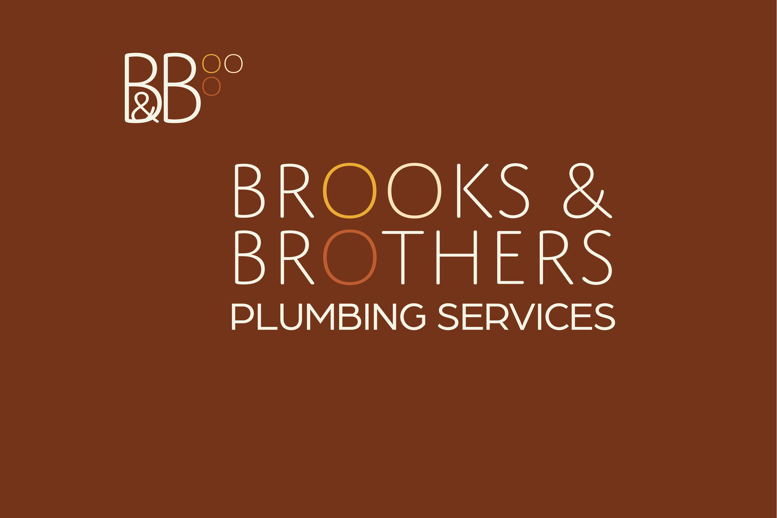
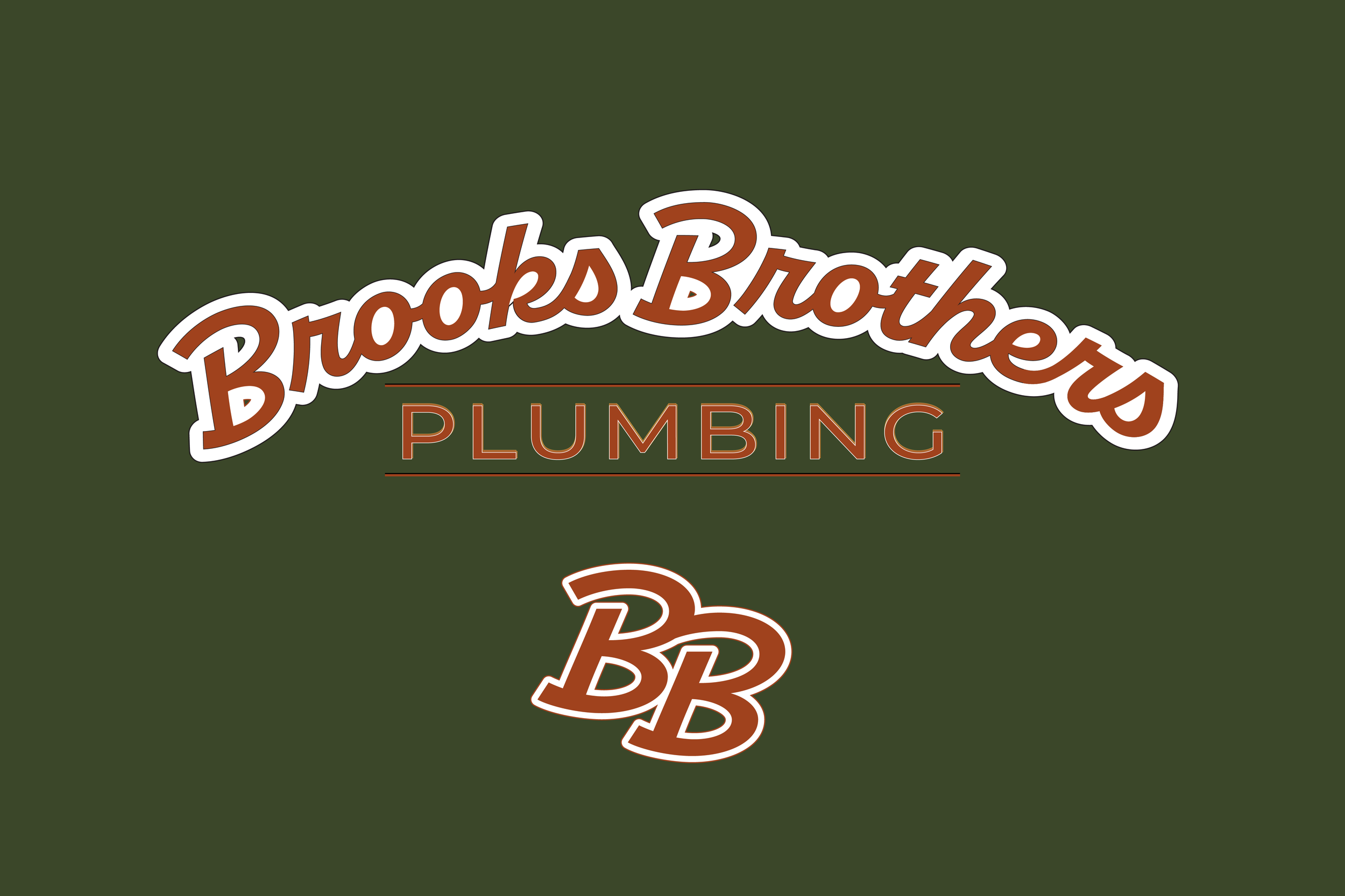
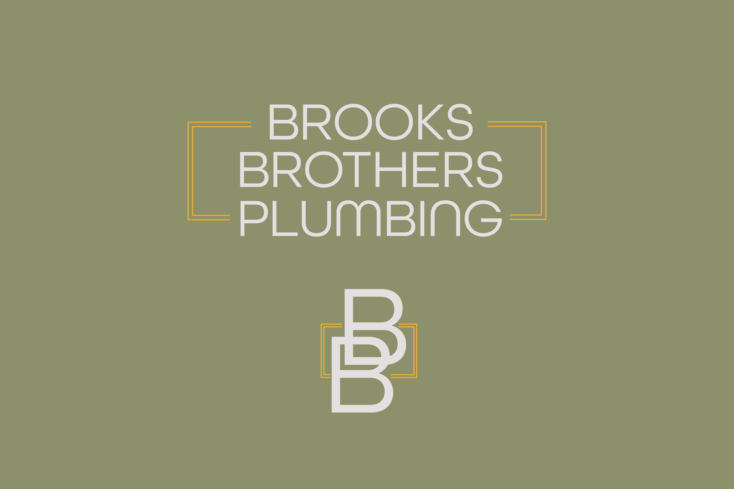
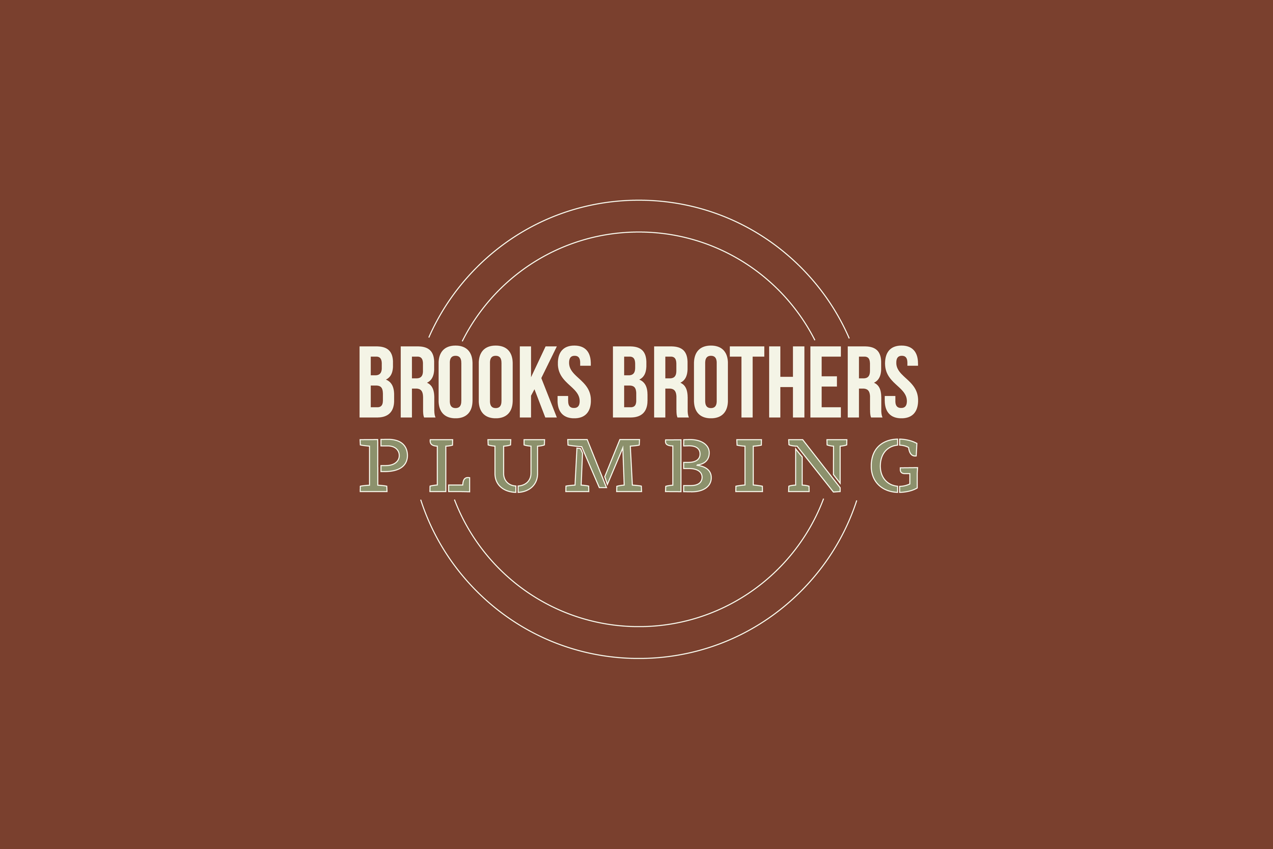
Early iterations


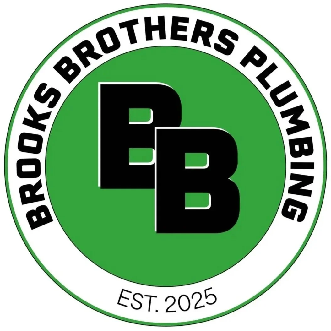
Our winner
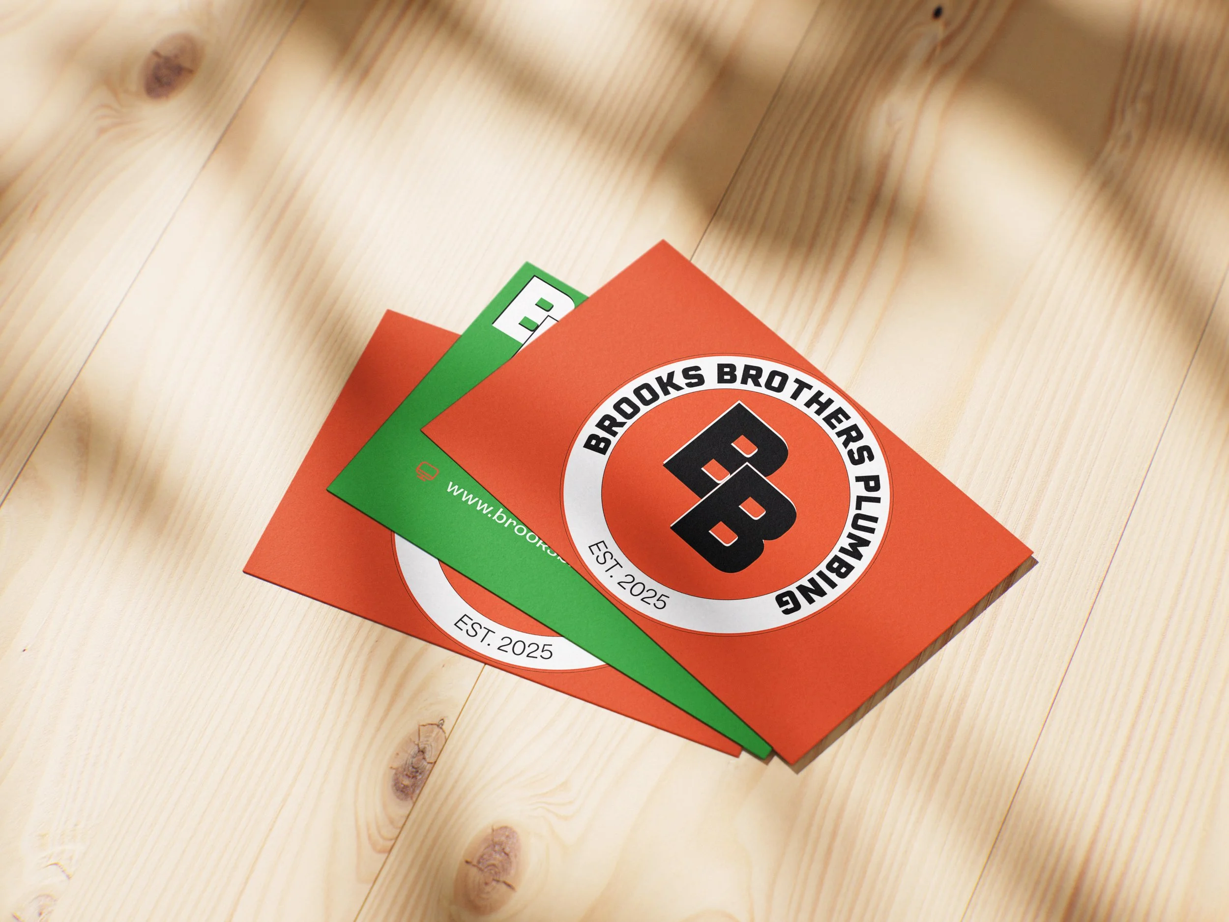
Brooks Brothers Plumbing decided on a circular emblem and a bold colour palette, working with bright, eye-catching green and orange. The logo was then adapted for many use-cases and also featured the double ‘B’ as an icon for social media, and other small decorative mentions.
The logo stood out with its bright pop of colour and readability at both small and large sizes. We met the request of recognizability and timelessness with a logo that mixes more of a retro theme with modern accents in both colour and typeface choices.
Additional branded mockups